Selected Work · Studio Presence
Bora Vodka
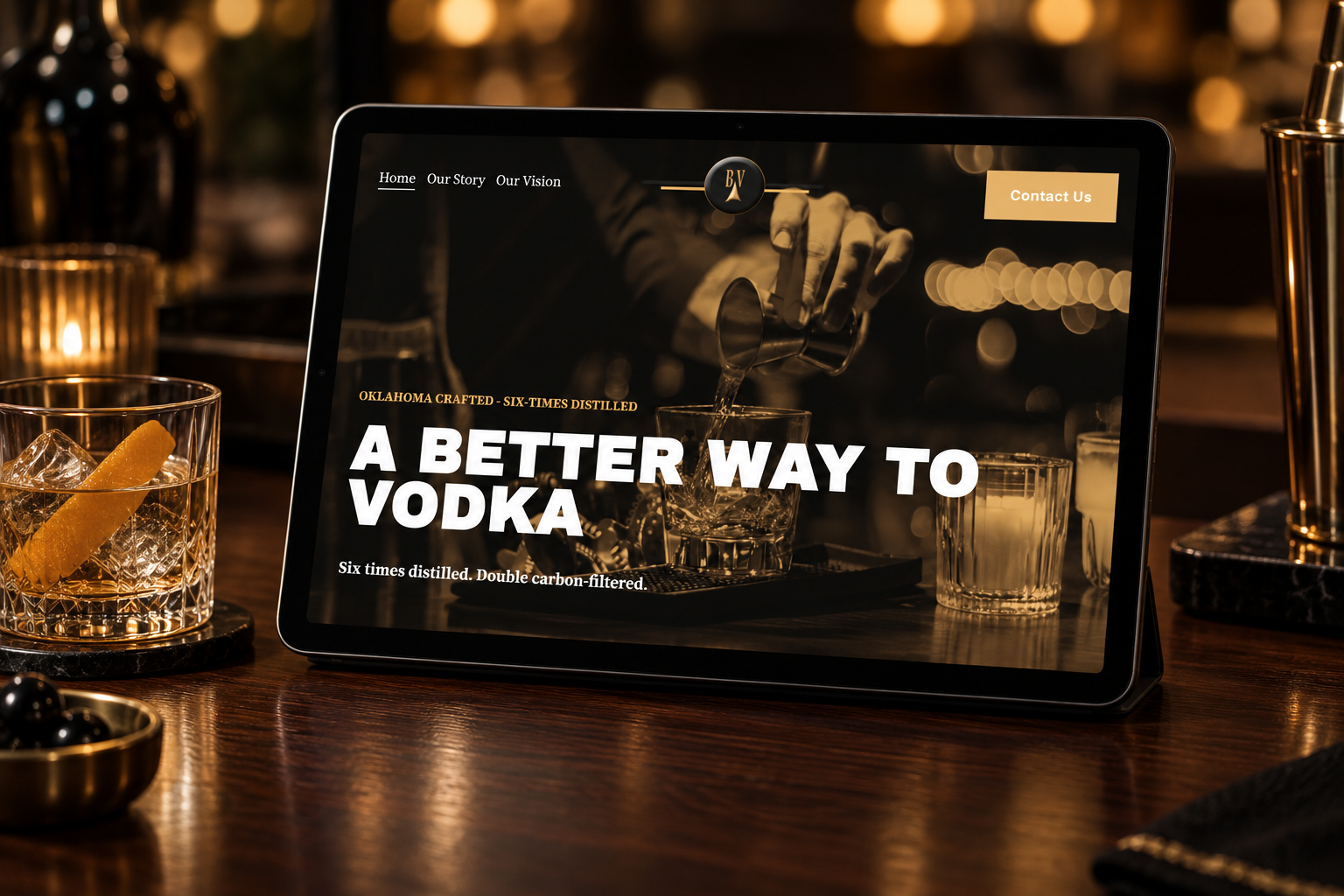
An art-directed website created to introduce an emerging spirits brand with the confidence of one ready to be remembered.
PROJECT OVERVIEW
An underdog, ready to enter the room.
Bora Vodka needed more than a polished website. It needed an identity strong enough to build awareness and inspire belief in what comes next.
This was a redesign of a website Kendall Douglas Studio first created two years earlier. As a new vodka brand entering a category filled with familiar, well-funded names, Bora needed a clearer structure and a visual presence that finally felt like a spirits company.
The new website introduces the product, gives its Oklahoma story room to breathe, and creates a credible brand destination that can support consumer awareness and future investor conversations.
New name. Main-character energy.
CLIENT
Bora Vodka
AUDIENCE
Vodka consumers + future investors
PLATFORM
Squarespace
PRIMARY GOAL
Brand awareness + funding readiness
STRATEGIC PROJECT SCOPE
From bottle to browser, one unmistakable world.
01
03
05
With full creative control, the project combined strategy, art direction, copy refinement, responsive design, and brand storytelling into one immersive digital experience.
07
Website strategy
A complete page hierarchy built around product introduction, origin story, recipes, vision, contact, and future growth.
Copy refinement
Client-provided messaging refined for clarity, confidence, consistency, and a more memorable product story.
-
A complete page hierarchy built around product introduction, origin story, recipes, vision, contact, and future growth.
-
A gallery-like visual language using deeper tones, layered imagery, and restrained motion to create a distinctive spirits identity.
-
Client-provided messaging refined for clarity, confidence, consistency, and a more memorable product story.
-
A full desktop and mobile experience created across every page, including the legal-age entry and contact pathways.
-
Client bottle photography paired with carefully sourced stock imagery and tonal overlays for one cohesive visual atmosphere.
-
A visual cocktail collection combining familiar classics with Black Wall Street, the brand’s original signature recipe.
-
Core page titles, structure, and search foundations created to support discovery as awareness grows.
-
Responsive testing, mobile refinement, and launch support for a consistent experience across devices.
Image curation
Client bottle photography paired with carefully sourced stock imagery and tonal overlays for one cohesive visual atmosphere.
Foundational SEO
Core page titles, structure, and search foundations created to support discovery as awareness grows.
02
04
06
08
Creative direction
A gallery-like visual language using deeper tones, layered imagery, and restrained motion to create a distinctive spirits identity.
Squarespace redesign
A full desktop and mobile experience created across every page, including the legal-age entry and contact pathways.
Recipe experience
A visual cocktail collection combining familiar classics with The Black Wall Street, the brand’s original signature recipe.
Launch refinement
Responsive testing, mobile refinement, and launch support for a consistent experience across devices.
WEBSITE STRATEGY
Build recognition before the shelf does.
Bora did not need to imitate an established vodka brand. It needed to look certain of its own point of view.
Because the consumer profile is still developing, the strategy focused on the category and the product rather than inventing a narrow lifestyle persona. The site communicates quality, craft, Oklahoma pride, and the pleasure of the pour through a deliberately artistic experience.
Black, white, and gold came directly from the existing logo. Deep overlays unify varied imagery while oversized typography, video, and cocktail photography give the brand the visual confidence needed for both consumer discovery and investor conversations.
Look established
Make the product memorable
Use art direction as distinction
Prepare for expansion
-
Create a confident, complete brand destination capable of standing beside names with far greater awareness and history.
-
Repeat the strongest differentiators—six-times distilled, double carbon-filtered, gluten-free, and Oklahoma-crafted—without losing atmosphere.
-
Build an immersive visual world that feels curated like a gallery rather than structured like a conventional product catalogue.
-
Create a flexible foundation ready for retailer-location tools, greater distribution, and future funding conversations.
Create a confident, complete brand destination capable of standing beside names with far greater awareness and history.
Repeat the strongest differentiators—six-times distilled, double carbon-filtered, gluten-free, and Oklahoma-crafted— without losing atmosphere.
Build an immersive visual world that feels curated like a gallery rather than structured like a conventional product catalogue.
Create a flexible foundation ready for retailer-location tools, greater distribution, and future funding conversations.
THE FINISHED PRESENCE
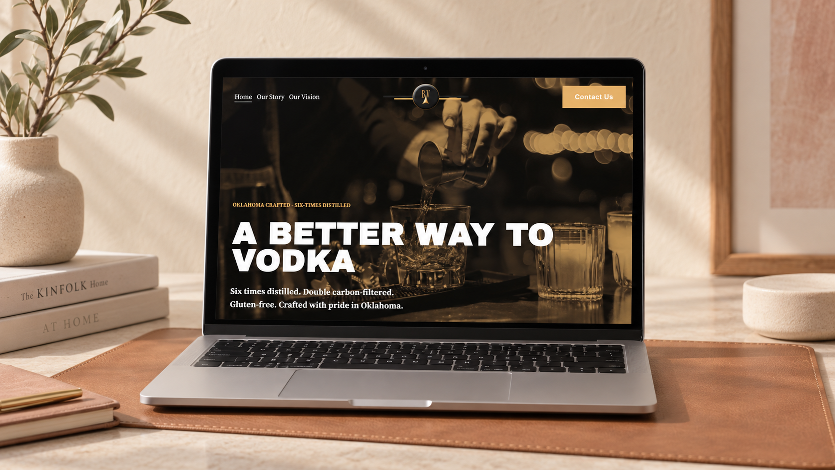
A visual world made for the pour.
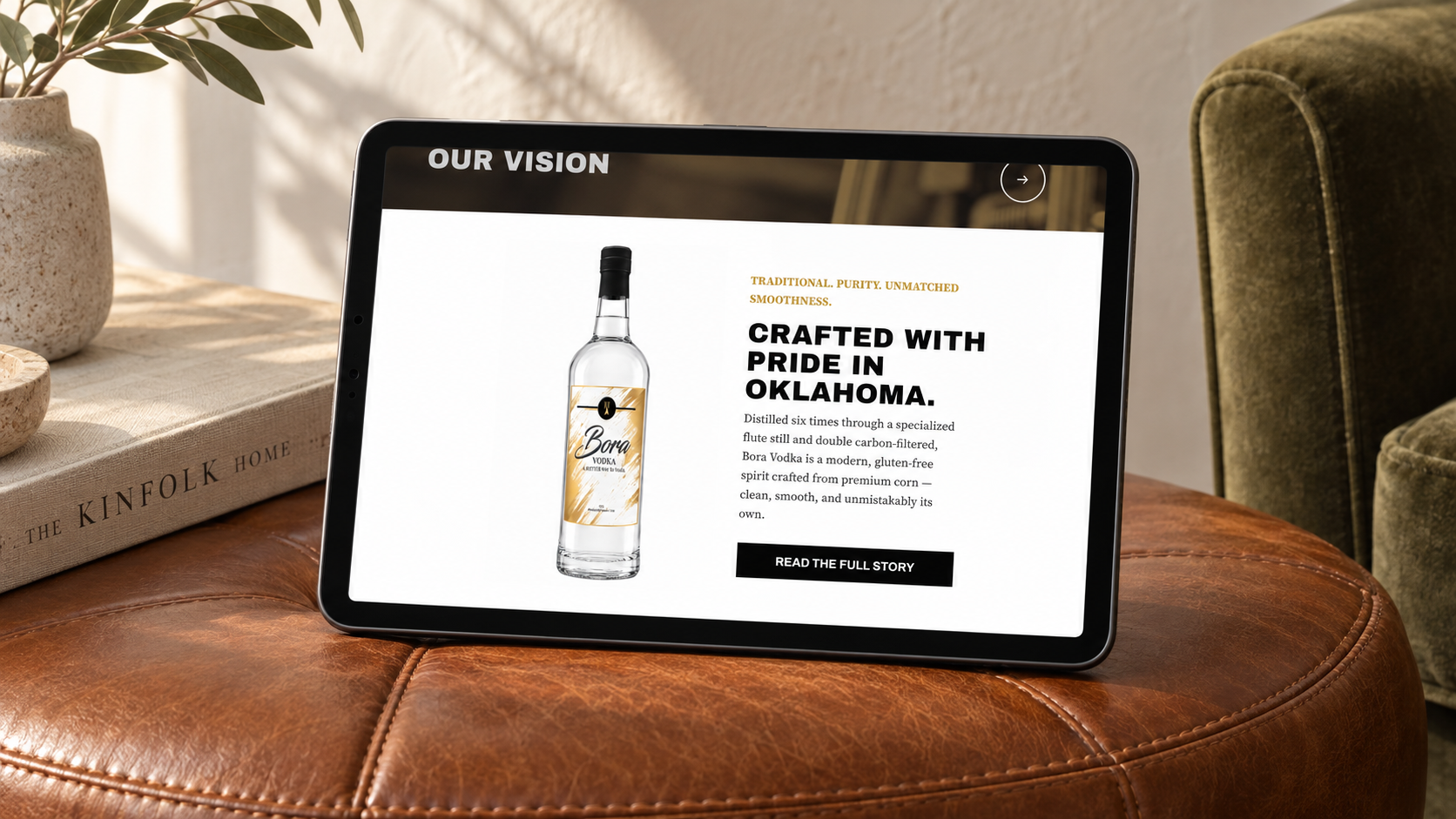
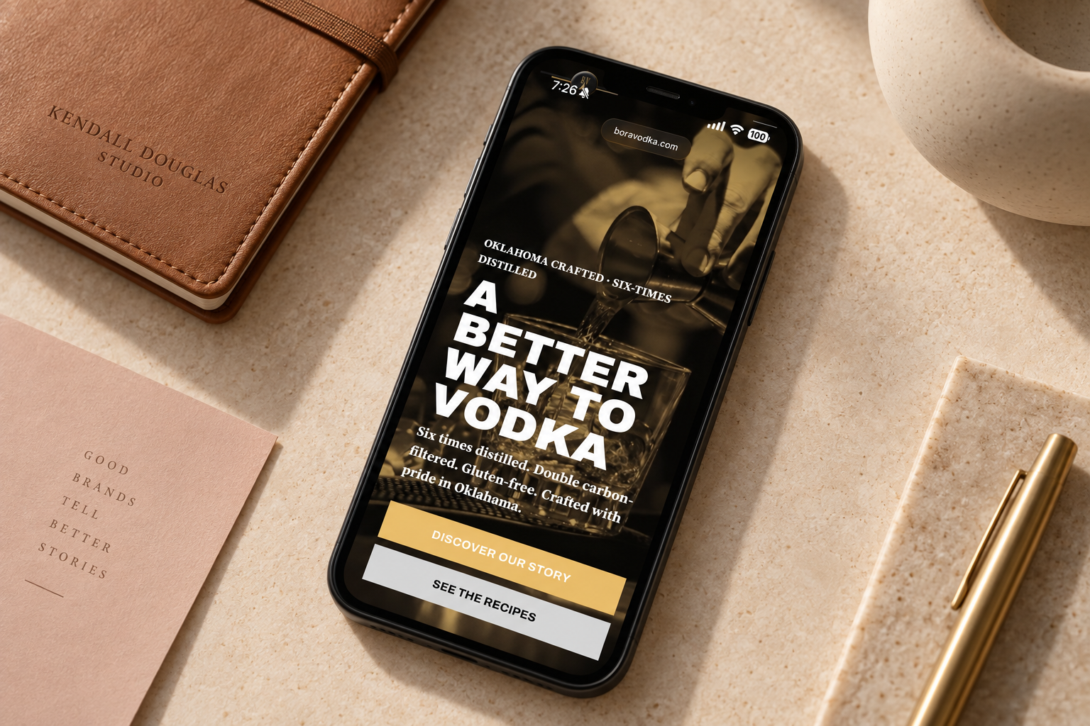
Dark, distinct, and ready to be noticed.
THE OUTCOME
A young brand with a grown-up presence.
Bora Vodka now has a website that makes its ambition visible.
The redesign launched only two weeks ago, so measurable performance data is still developing. The immediate response, however, has been consistently positive: the client loved the finished site, and viewers have responded to the distinctive imagery and atmosphere.
More importantly, the website now gives Bora a credible destination for introductions, awareness building, and conversations about funding and future distribution.
01
A recognizable black, white, and gold visual identity
02
A clearer product and origin story
03
An immersive recipe and brand-discovery experience
04
A flexible foundation for retailer and distribution growth
CREATIVE REFLECTION
A different kind of Kendall Douglas project.
ART DIRECTION NOTE
Less editorial and more artistic, Bora Vodka became one of the studio’s most visually distinctive builds, proof that a cohesive presence does not require every image to look the same.
YOUR IDEA DESERVES A WORLD OF ITS OWN
Ready for a website people remember?
Let’s create an online presence that gives your vision a distinct point of view—and makes the next stage of growth easier to believe in.
Let’s build some great sh*t together.